The Euno logo is a modular mark built from the shapes of our name. These are the rules that keep it consistent everywhere it lives.
Logotype
The euno mark
The logotype is our primary identity — a custom wordmark paired with a geometric icon built from the four letters of our name: e, u, n, o.
The logotype is available in three color versions: black (default), white (for dark backgrounds), and on-brand purple.
Use black on light backgrounds
Use white on dark backgrounds
Never place on a busy or patterned background
Always maintain proportional aspect ratio
Clear space
X
X
Maintain a clear space equal to X (the height of the icon) on all sides. Never crowd the mark.
Minimum sizes
24px
Screen
8mm
Print
Icon
The symbol
The icon mark is used independently when the euno brand is already established — app icons, favicons, social avatars, and in-product UI.
Never use the icon alone in contexts where euno is not yet known to the viewer.
Accepted rotations
✓ 0°
✕ 45°
✕ 180°
Don't
Change the color of the logo
Squash or stretch the logo
Recreate the logo using a different font
Outline the logo
Fill the logo with images or gradients
Place on a busy or patterned background
Rotate or skew the logo — only 0° is accepted
Change the logo's spacing or proportions
Bottom-left
Bottom-right
Presentations
Logo in presentations
In slide decks, place the logo in a bottom corner — bottom-left or bottom-right — and keep it in the same spot on every slide. Consistency is what makes the deck feel unmistakably euno.
Bottom-left or bottom-right — pick one, stay consistent
A focused palette of core brand colors. Almost white leads as the main background, with euno green, lilac and mint for depth and accent.
Core Brand Colors
The euno palette
euno lilac
#EDDFFF
CMYK 5/12/0/0
PANTONE 2635
#CDA9F0
#6029A8
#311460
euno mint
#E5F4F0
CMYK 9/0/6/0
PANTONE 7457
#B1DED3
#3E6F64
#16221F
euno gold
#FDF5EB
#FBEBD2
#F4D9A6
#3B1608
euno almost white
#FBFBFB
CMYK 1/0/1/0
euno dark green
#0E3A2F
CMYK 87/51/73/58
PANTONE 3305
Gradients
Lilac Wash
#FDFCF6 → #E9DBFF
Mint Wash
#F3FAF8 → #B1DED3
Midnight
#2B2A38 → #836B83
Identity
Typography
Three typefaces, each with a distinct role.
ABCDEFGHIJKLM NOPQRSTUVWXYZ
abcdefghijklm nopqrstuvwxyz
0123456789
!@#$%&()[]{}—·…
In use — Hero
The answer is context
Euno enables agents like Claude and Cursor to work on top of enterprise data, so they always query the right data, using the right logic, even in the most chaotic environments.
Plus Jakarta Sans
Primary typeface
Plus Jakarta Sans is our primary typeface — used across product UI, marketing, and brand communications. Geometric, modern, and highly legible at every size.
Our main typeface — for large headlines
Use only Bold (700) or Regular (400)
Bold for primary headlines; Regular for large headings
Leading: 105–110% at headline sizes
Free on Google Fonts
Primary
ABCDEFGHIJKLM NOPQRSTUVWXYZ
abcdefghijklm nopqrstuvwxyz
abcdefghijklm nopqrstuvwxyz
In use — Hero
The answer is context
Euno enables agents like Claude and Cursor to work on top of enterprise data, so they always query the right data, using the right logic, even in the most chaotic environments.
Caudex
Accent display typeface
Caudex is our editorial serif — used to spice up a large headline. It appears as a single word inside the headline, contrasting against Plus Jakarta Sans beside it.
Set that one word in brand purple or euno-black to make it stand out.
Use for a single accent word inside a headline
Colour the word purple or euno-black
Pairs as contrast against Plus Jakarta Sans
Never for full headlines, UI, or body copy
Free on Google Fonts
Accent · One word
ABCDEFGHIJKLM NOPQRSTUVWXYZ
abcdefghijklm nopqrstuvwxyz
0123456789
In use — Running text
Euno enables agents like Claude and Cursor to work on top of enterprise data, so they always query the right data, using the right logic, even in the most chaotic environments.
Inter
Running text typeface
Inter is our typeface for reading — documentation, articles, in-product help text. Optimized for screens at small sizes with open apertures and clear letterforms.
Documentation and long-form content
Minimum 13px on screen
Leading: 170–180% for paragraphs
Regular (400) body · Medium (500) emphasis
Free on Google Fonts
Running Text
Typography
Type hierarchy
Style
Typeface & specs
When to use
Heading
PJS 700 · 44–80px · LH 105%
Hero headlines, primary marketing
is context
Caudex 700 · accent word, purple/black
One word inside a large headline
Sub-heading
PJS 700 · 20–26px · LH 130%
Section titles
Body
Inter 400 · 14–16px · LH 175%
Paragraphs, running text
Caption
Inter 600 · 10–11px · Track +80
Captions, overlines, eyebrows
How it works
Three fonts, one system
Plus Jakarta Sans leads — at every size from hero to label.
Caudex punctuates — selectively adding editorial weight and emotional resonance.
Inter sustains — for text that needs to be read, not just seen.
Typography
Combining typefaces
Imagine what AI can do when it's truly connected to your enterprise data…
When AI can ground its decisions in your data, it can take on your biggest enterprise challenges: analytics, operations, security & compliance, and data powered applications.
PJS Bold + Inter
The only enterprise context platform built for how AI agents work
Euno enables agents like Claude and Cursor to work on top of enterprise data, so they always query the right data, using the right logic, even in the most chaotic environments.
PJS Bold + Inter
AI lacks the context to navigate a cluttered, complex data environment
AI can't tell the difference between a battle-tested metric and a forgotten experiment, it'll happily use both. With equal confidence.
PJS Bold + Caudex accent + Inter
Typography
Do-Nots
✕ Don't use Caudex for headlines or body
The future of data is clear.
And a paragraph set entirely in Caudex.
Caudex is only for a single accent word inside a headline.
✕ Don't use Inter for headlines
A big headline set in Inter
Inter is for running text only — use Plus Jakarta Sans for headlines.
✕ Don't mix all three fonts in one block
Big headline
Sub-headline following along
And body copy right after.
Max two typefaces per composition.
✕ Don't stretch or condense type
euno
Never distort proportions. Choose a different weight.
✓ Caudex as a single accent word
The answer is context
Euno surfaces the data you need, exactly when you need it.
One Caudex word for contrast — the rest in Plus Jakarta Sans.
✓ Inter for long-form reading
Euno's data catalog indexes your tables, columns, and relationships — making discovery instant for every analyst on your team.
Comfortable reading rhythm at correct leading.
Identity
Graphics
Icons, illustrations, and shape language that make the euno world feel alive and consistent.
Graphics
Icons
Click any icon to copy as PNG — paste directly into Google Slides, Figma, or any design tool.
Eunocorn
Shield
Compass Star
Compass
Lock
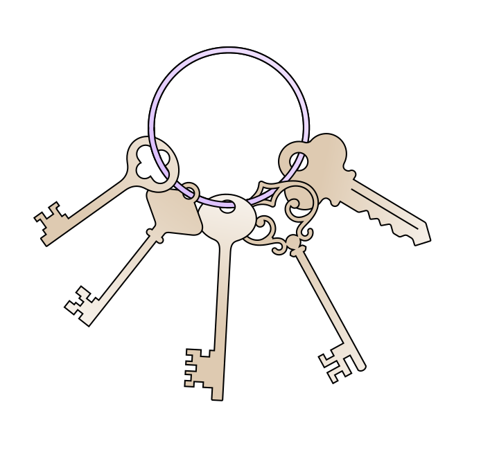
Keys
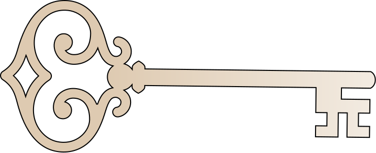
Key
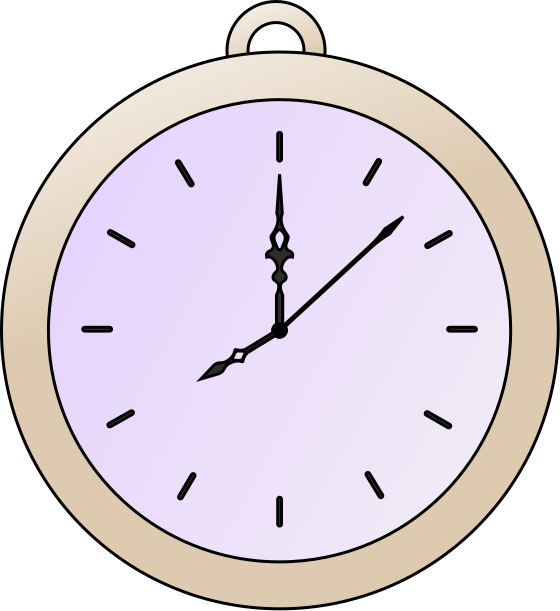
Pocket Watch
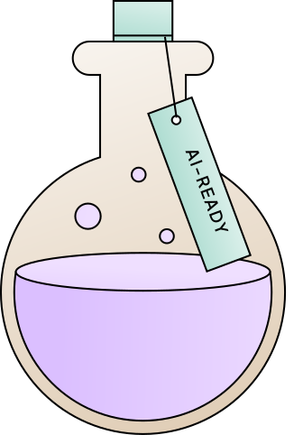
Potion
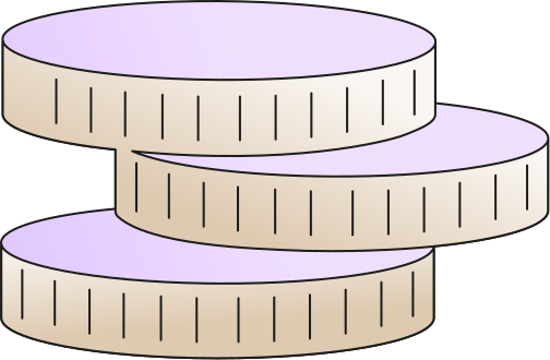
Coins
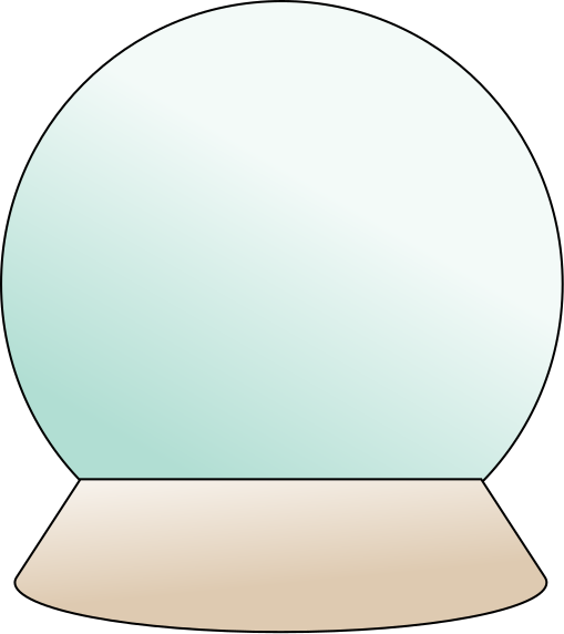
Crystal Ball
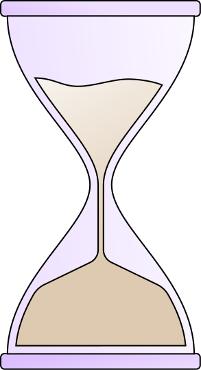
Hourglass
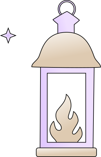
Lantern
Column
Tower
Door
Scroll
Writing
World Map
Swords
Robot
Floppy Disk
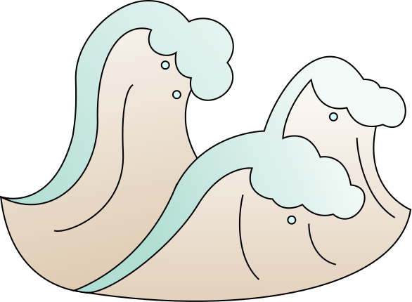
Waves
Storm
Cloud
Constellation
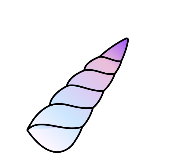
Horn
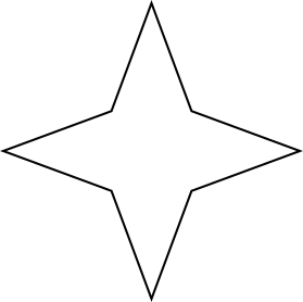
Star
Binoculars
Medal
Medallion
Tag
Bell
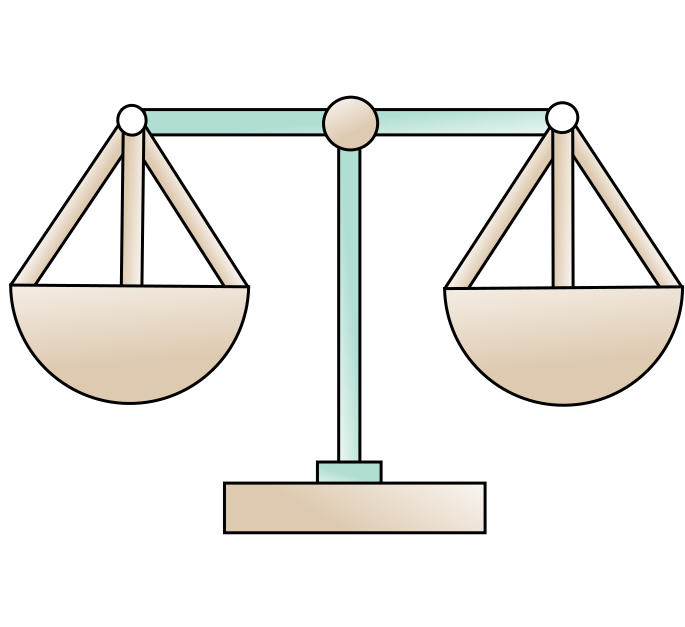
Scale
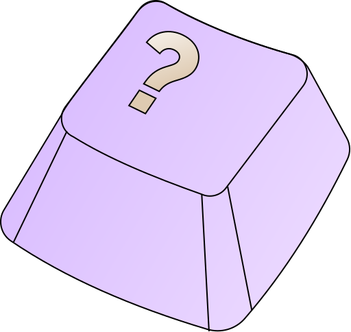
Key Cap
Graphics
Graphics
Fuller graphic guidelines are coming soon. For now, every euno graphic follows three simple rules.
Outlines are a consistent 1px stroke
No shadows — keep every graphic flat
Fill interiors with gradients built from the primary colors
Graphics
Shape Language
euno's shape language is rooted in the four geometric forms of the logo mark — circles, arches, D-shapes, and U-shapes. More details coming soon.
Resources
Useful Documents
Ready-to-use euno templates — open in Google and make a copy.